Visualization of movies - Part II - The Batman Trilogy
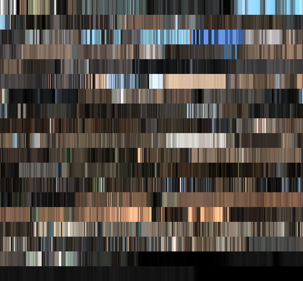
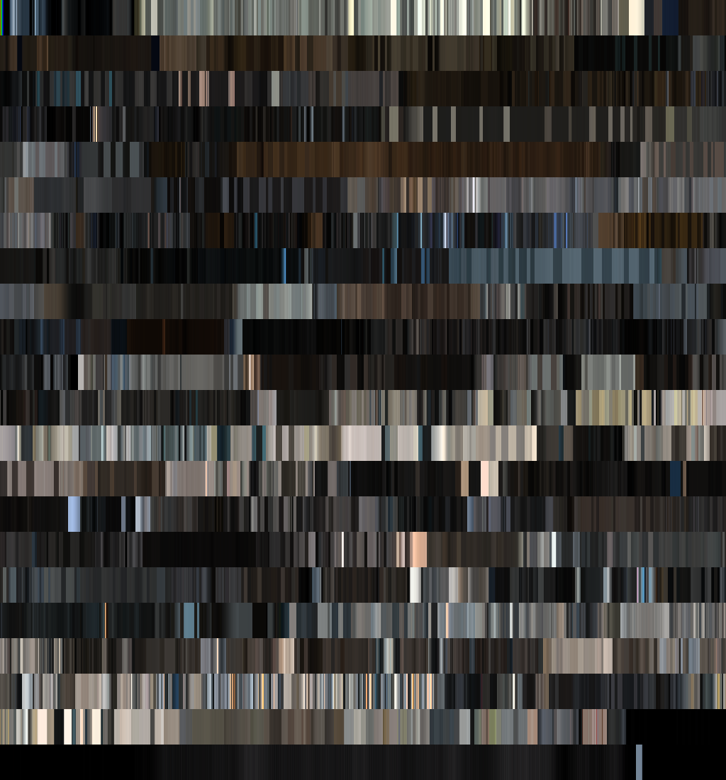
A couple of weeks ago I showed the first results of my attempt at movie color analysis. In this page you can view the images created from that experiment. The images looked nice, but there where, as some people were quick to point out, some issues with the colors. The colors were over saturated and way to bright. The images did reflect the color usage throughout the movie, but weren't very accurate. A week ago I experimented with the saturation and color settings available in boblight to see if I could get a more reliable color representation. After some tuning I think I've got a better mix. So for part II of this experiment, I ran the Batman trilogy through the analysis. The results you can see on this page. Just as for the previous experiment, if you have any comments, requests or anything else, let me know through twitter. An explanation can be found at at the smartjava site here.
Comparison of the movies
The following donuts show the colors used inside the movies. Organized from dark to light. The width of a color segment corresponds to how much that specific color is used in the movie. As you can see the color usage in "The Dark Knight" and in "The Dark Knight Rises" is pretty much the same. "Batman Begins" has more brown elements and is generally a little less dark than the other two.
Batman Begins
The Dark Knight
The Dark Knight Rises
Color usage in the movies
Batman Begins:
The Dark Knight:

The Dark Knight Rises:
Background from here More information and articles on smartjava.org