Euro debt and financial crisis visualized with timeline using d3.js and Three.js
In a couple of recent articles I’ve been using Three.js and d3.js to create 3D maps and visualize metrics. In the last week I combined a couple of these techniques to create a visualization of the financial/debt crisis in the Eurozone:
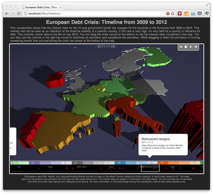
What does this timeline represent?
In this timeline I show how the interest rates for the long term bonds change over time for the Countries of the Eurozone. This is the interest rate countries pay to refinance their debts. Why is this interesting? This interest rate is a very good indication of the financial stability of a country. Is the rate high, then refinancing debt will cost more and more and interest payments will go up. A situation which, at certain percentages, will bankrupt a country.
In this visualization the following is shown:
- Timeline at the bottom shows events that occur during the period 2009 to 2012.
- For each event a 'bubble' is shown that explains a bit more about the event.
- The map shows the countries. Green means low debt rate, red means high debt rate.
- For better visualization the height of a country is also defined by this debt rate.
Techniques used
This timeline uses the following techniques:
- d3.js: This library is used to create the timeline visualization at the bottom.
- Three.js: To visualize the interest rate a 3D model is created in Three.j
In a couple of future articles I’ll go into more detail on how the various libraries are used.